But what if a computer isn't available during the pass??
It's actually pretty straightforward to hand-draw a radar plot based on just some simple information printed out previously from any of the standard satellite prediction web pages or software modules. I'll often take such a list (ie. all passes for the next 5 days) with me while operating satellite portable, just in case the computer goes down and can't provide real-time tracking. The method below shows how to create your own radar plots.
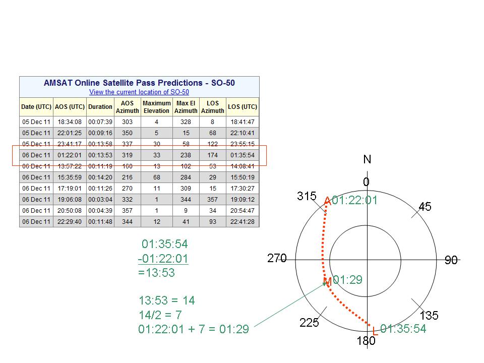
Step 1: Start with a table of passes. You can obtain these from various tracking packages, or from the http://www.amsat.org website.

Step 2: Draw a crosshair on a piece of paper. Mark one end "N" for north:

Step 3: Draw two concentric circles on the crosshair. The outer one represents the horizon, the inner one represents an elevation of 45 degrees:

Step 4: Add four tick marks to the perimeter of the outer circle at 45, 135, 225, and 315 degrees:

Step 5: Write the degree markings around the azimuth circle: 0, 45, 90, 135, 180, 225, 270, and 315 degrees:

Step 6: Mark the AOS (acquisition of signal) on the perimeter circle. In this example, the AMSAT prediction table shows the AOS at 319 degrees. Mark with a letter "A":

Step 7: Mark the LOS (loss of signal) on the perimeter circle. In our example table, LOS occurs at 174 degrees. Mark with a letter "L":

Step 8: Draw a faint line between the AOS and LOS marks. This will tell you if the satellite is passing overhead to the east or west. In this case, our satellite will pass to the west of the North-South line:

Step 9: Mark the position of Maximum Elevation on the plot. Max El will occur about half way along the AOS-LOS line, and the elevation will come from the value in the table. In this case, a Max El of 33 degrees is roughly 2/3 of the way from the outer circle (0 degrees El) to the middle circle (45 degrees El). Place a letter M at the point of max elevation:

Step 10: Draw a smooth curve from the AOS, through Max El, to LOS:

Step 11: Now it's time to add times to the plot. Take the time of AOS from the chart and add it to the circle next to the A:

Step 12: Similarly, copy the time for LOS to your plot:

Step 13: The time of Max Elevation is half way between the times of AOS and LOS. You can usually guesstimate this time, or you can subtract the AOS from LOS, divide by two, and add to AOS. Mark the time next to the M:
Step 14: Now add the times half-way between AOS and Max El, and Max El and LOS. I find guesstimating is usually more than adequate:

Now you're done! You've gone from a table of a few numbers to a nice handy radar plot, suitable for tracking the satellite as it moves across the sky. Of course the chart isn't dead on accurate, but given the beamwidth of our handheld antennas, it's more than close enough to accurately aim them.
Here's another example from a different pass.
First, draw your crosshairs and mark the A for AOS and the L for LOS:

Next, mark the position of Max Elevation with an M:

After that, draw the curved line connecting the letters, to show the path of the satellite:

Next, mark your AOS and LOS times:

And finally mark the intermediate times:

Easy!
Again, these plots aren't intended to replace the precision of a real-time computer tracking display, but I have found that knowing how to create these plots is a really useful backup for when the computer isn't around.